
On this page
- Why Virtual Try-On Matters for Fashion Ecommerce in 2026
- Two Implementation Paths: App vs. Custom Development
- Choosing the Right Virtual Try-On App for Shopify
- Step-by-Step: Installing Virtual Try-On in Under 10 Minutes
- Strategic Placement: Where Try-On Works Best
- Configuring Category-Specific Copy and Messaging
- Mobile-First QA Checklist Before Launch
- Soft Launch Strategy: Start With Hero SKUs
- Analytics and Success Metrics That Actually Matter
- Pairing Try-On With Your Complete Product Page Stack
- Expanding Beyond Initial SKUs: Rollout Plan
- Common Implementation Mistakes to Avoid
- Next Steps: From Installation to Optimization
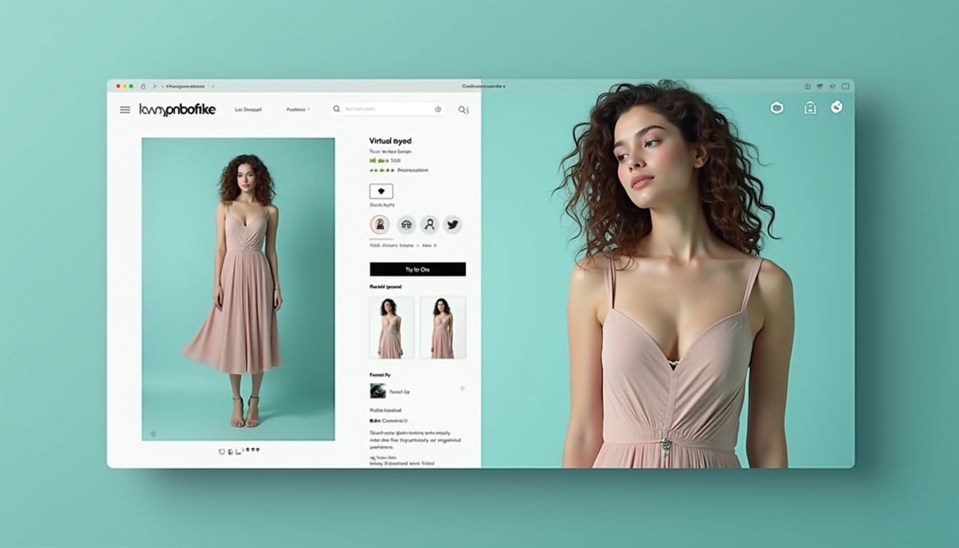
Virtual try-on technology has transformed from a novelty into a conversion necessity for Shopify clothing stores. When customers can see how a garment looks on their own body before purchasing, they buy with confidence—and return less. The technology that once required custom development and six-figure budgets now installs as a Shopify app in under 10 minutes.
This guide walks you through the complete implementation process, from choosing the right app to measuring actual ROI. Whether you're selling dresses, denim, swimwear, or accessories, you'll have virtual try-on live on your store by the end of this article.
Why Virtual Try-On Matters for Fashion Ecommerce in 2026

The core problem in online fashion retail hasn't changed: customers can't touch the fabric or see how it fits their body. Virtual try-on solves the second half of that equation. According to Shopify's enterprise research, stores implementing virtual fitting room technology see measurable improvements in conversion rates and significant reductions in fit-related returns.
The technology works by using AI models to realistically render your product images onto photos customers upload. Modern implementations preserve garment details like drape, texture, and fit characteristics while adapting to different body types. The result looks natural enough that customers trust it as a decision-making tool—not just a gimmick.
Beyond conversion metrics, virtual try-on shifts the type of customer service inquiries you receive. Instead of answering endless "how does this fit?" questions, your support team handles more productive conversations about shipping and styling. For high-return categories like dresses, swimwear, and denim, this alone justifies the modest app subscription cost.
The timing matters too. As Antla's implementation guide notes, mobile traffic now dominates fashion ecommerce, and virtual try-on works best on mobile devices where customers naturally have photos of themselves available. Desktop implementations exist, but the friction is higher—customers need to find and upload a photo rather than simply taking one.
Two Implementation Paths: App vs. Custom Development
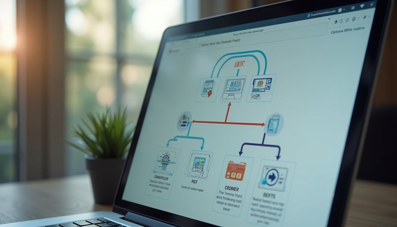
You have two realistic options for adding virtual try-on to your Shopify store, and one of them is wrong for 95% of merchants. The build-it-yourself approach requires wiring up an AI model API, creating upload widgets, handling image storage and moderation, managing GPU costs per generation, and maintaining the entire pipeline. This path makes sense only if you're a 50-person brand with in-house developers and specific customization requirements that no existing solution addresses.
The correct answer for most stores is installing a purpose-built Shopify app. As Craftshift's implementation guide explains, a dedicated app handles the AI model, upload flow, generation queue, theme embedding, and analytics automatically. You're live the same afternoon, not after months of development.
Modern try-on apps integrate through Shopify's standard app blocks—the same drag-and-drop interface you use for other theme customizations. No Liquid editing, no code deployment, no technical debt. When Shopify updates their theme architecture or you switch themes, the app continues working because it hooks into the platform's native extension points.
The cost difference is dramatic. Custom development starts at $50,000-100,000 plus ongoing GPU and maintenance costs. App subscriptions typically run $20-50 monthly with usage-based pricing for generation volume. Unless you're generating 10,000+ try-ons daily with specific workflow requirements, the app math wins decisively.
Choosing the Right Virtual Try-On App for Shopify
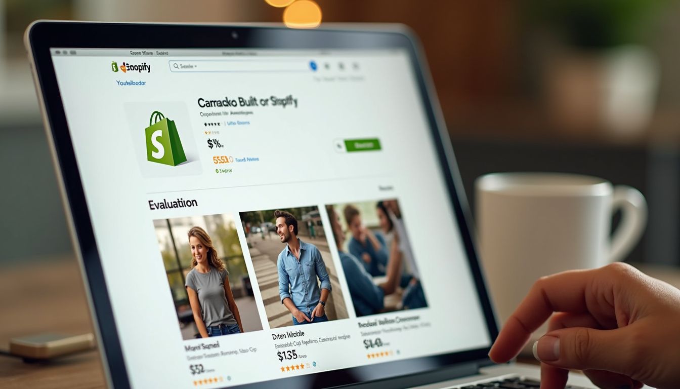
Not all virtual try-on apps deliver the same quality or feature set. The three non-negotiable criteria are realism, speed, and product coverage. Realism means the generated image preserves garment details without warping fabric or distorting the customer's face. Poor implementations create uncanny valley results that destroy trust faster than no try-on at all. One Antla reviewer captured this: "the best AI try on app so far, fast and easy to use, most importantly, it is very accurate and real."
Speed determines whether customers actually complete the try-on flow. If generation takes 30 seconds, they've already moved to another tab. The target is under 10 seconds from upload to result—fast enough that it feels like an interactive product view rather than a batch process. TryOnCloud reports first-generation times of around 7 seconds, which sits in the acceptable range.
Product coverage matters because not all apps handle the full fashion catalog. Basic implementations work only for tops and dresses. Better options extend to swimwear, outerwear, bags, jewelry, and eyewear. Check whether the app supports your specific product mix before installing. If you sell primarily accessories or categories beyond basic apparel, verify compatibility first.
Look for apps carrying Shopify's "Built for Shopify" badge—this indicates the app meets Shopify's quality standards for performance, privacy, and integration patterns. High ratings (4.8+) with substantial review volume (50+) signal reliability. Installation count matters less than review sentiment; read the three-star reviews to understand real limitations.
Step-by-Step: Installing Virtual Try-On in Under 10 Minutes
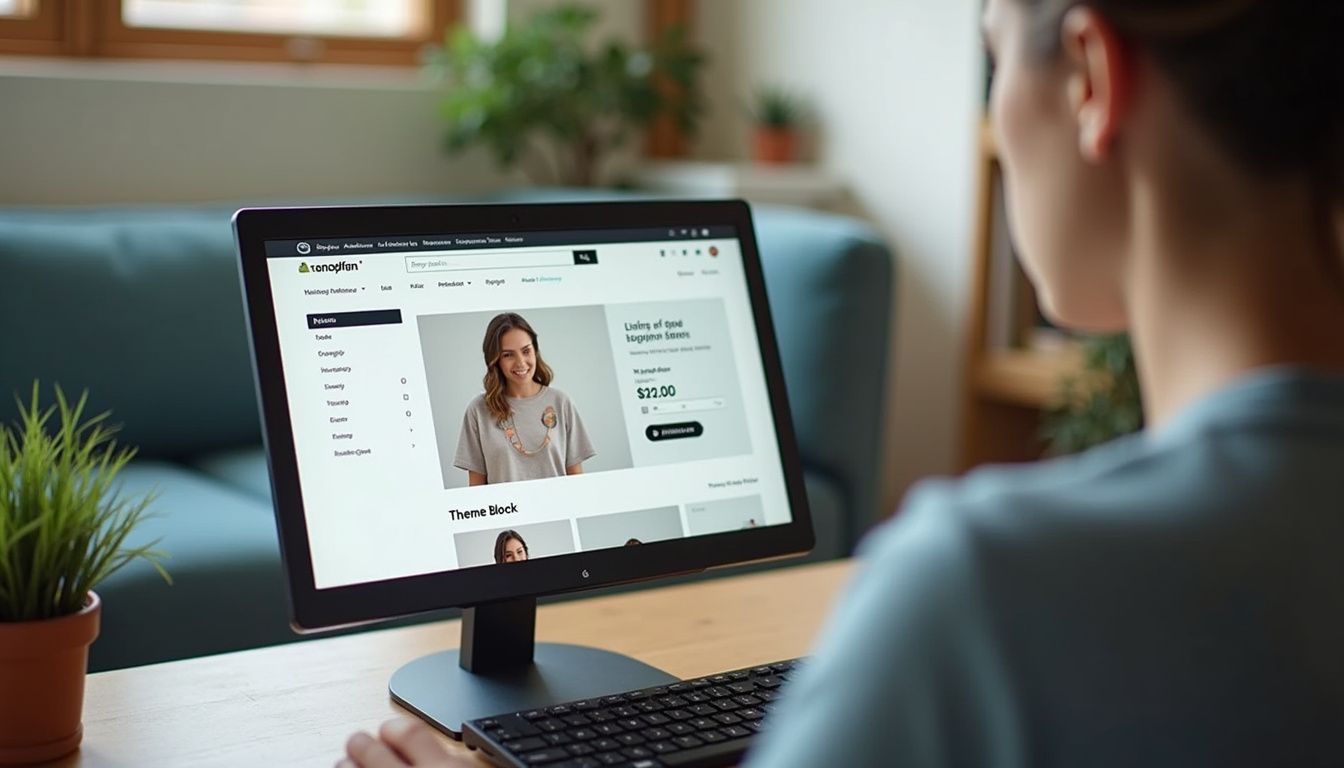
We'll walk through installation using Antla AI Virtual Try-On as the reference implementation, since it carries the Built for Shopify badge and requires zero code. The process follows the same pattern for any modern try-on app built on Shopify's app block system.
First, navigate to the Shopify App Store and search for your chosen virtual try-on app. Click "Add app" on the listing page. Shopify displays the OAuth permission screen showing what access the app requires—typically read access to your product catalog and the ability to inject interface elements. These are standard permissions for this category. Approve them to continue. The app installs immediately and appears in your Apps list in Shopify admin.
Next, open the Shopify Theme Editor by navigating to Online Store → Themes → Customize. This launches the visual theme customization interface. You're working with your live theme, but changes don't publish until you click Save, so you can experiment freely. Locate the Product information section in the left sidebar—this controls the layout of your product pages. Click "Add block" at the bottom of this section.
In the block picker that appears, find and select your try-on app's button block. For Antla this shows as "TryOnCloud — Try On Button"; other apps use similar naming. The block appears in your product page layout. Drag it to position just below your Add to Cart button—this placement drives the highest engagement because customers see it at the natural decision point. Avoid hiding it in tabs or burying it below the fold on mobile.
Configure the block appearance using the settings panel on the right sidebar. You can customize button text ("Try It On", "See It On You", "Virtual Try-On"), colors to match your brand, size, and styling. Keep the text plain and action-oriented—customers understand "Try It On" better than creative alternatives. Make the button visually distinct but not garish; it should feel like a native feature, not a bolted-on widget.
Click Save in the top right corner of the Theme Editor. Your virtual try-on button is now live on all product pages using this template. To verify, open any product page on your live storefront in an incognito window. You should see the try-on button below Add to Cart. Click it, upload a test photo (use your own or a model image), and confirm the generation completes correctly. Test on both mobile and desktop—mobile is where most customers will use this feature.
Strategic Placement: Where Try-On Works Best
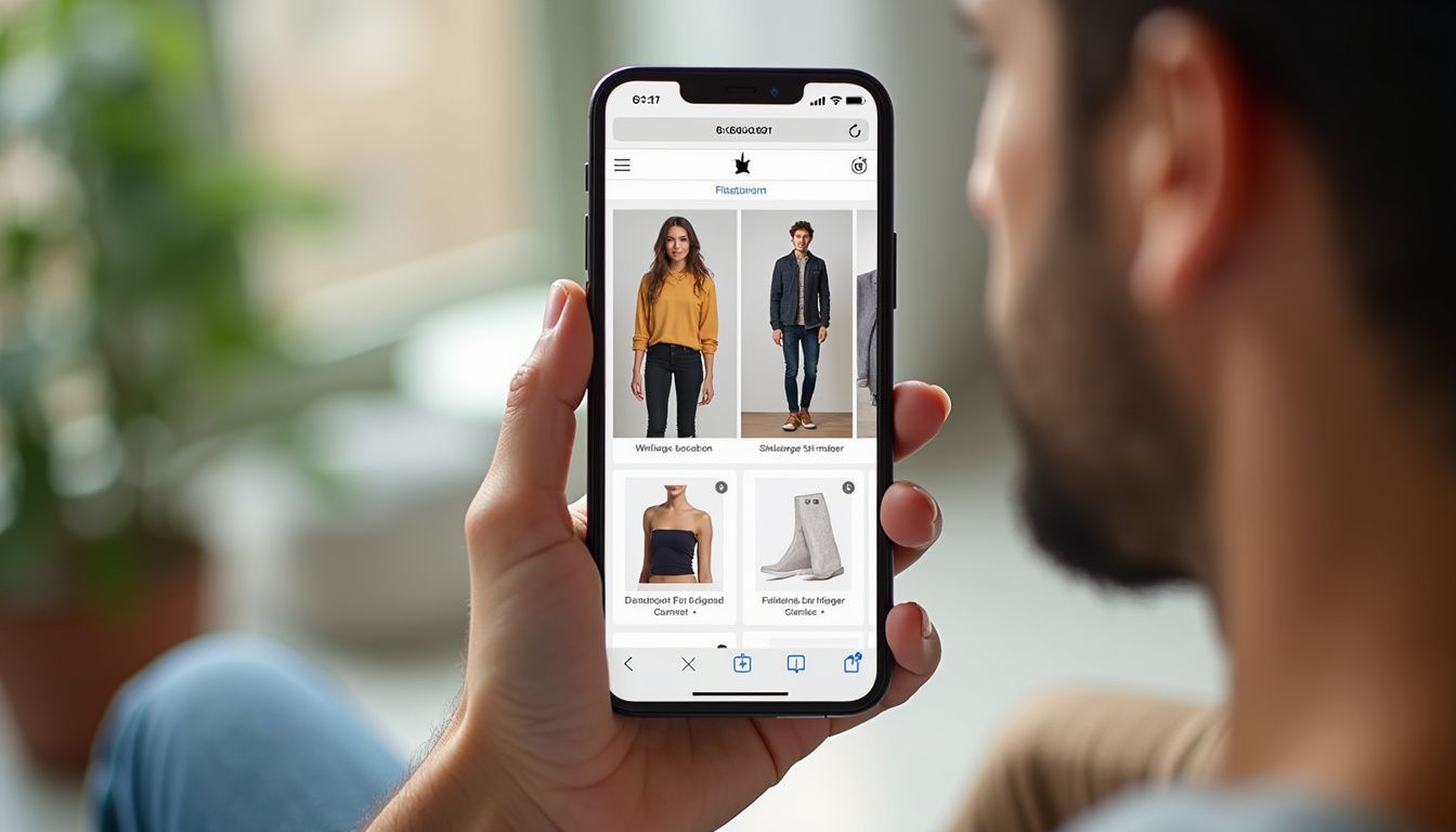
Placement beats features. Customers won't hunt for a try-on option hidden in a footer link or buried in a text accordion. According to Antla's merchant guidance, the strongest performing placements are below or integrated with the primary image gallery, above the fold on mobile after the first image swipe, near the size selector when customers frequently bracket sizes, and adjacent to fit notes on high-risk categories like swim and intimates.
Weak placements that consistently underperform include isolating try-on on a separate landing page that requires navigation away from the product, hiding it behind a text link below reviews where it's only visible after scrolling, and implementing try-on as a desktop-only popup while offering no mobile entry point. Mobile-first placement isn't optional—mobile devices account for the majority of fashion traffic and provide the natural use case where customers already have photos of themselves available.
Run your placement decision on two real devices, not just browser resize. Upload a photo, run a try-on session, and observe where friction appears. Does the button feel like a natural part of the product decision flow? Can you reach it without scrolling? Does it compete with or complement the size selector? The best implementations integrate try-on with your existing fit communication rather than presenting it as a separate feature.
Consider category-specific placement variations. For dresses where length is the primary fit concern, position try-on near length specifications. For denim where rise and fit type matter most, place it adjacent to fit descriptions. For swim and intimates where coverage is sensitive, integrate it with your privacy messaging so customers understand how their photos are used and stored.
Configuring Category-Specific Copy and Messaging

Generic "Try It On" buttons work, but category-specific copy converts better by addressing the specific uncertainty the customer faces with that product type. Antla's implementation guide recommends adding one sentence inviting try-on in plain language that names the specific fit question the customer is asking.
For dresses, focus on length and drape: "See how this midi length looks on you before you choose a size." For denim, emphasize rise and fit: "Upload a photo to preview shoulder fit and drape on your frame." For swimwear and intimates where coverage matters most: "Check coverage and rise on your image for swim and intimates." The copy should feel like helpful guidance, not marketing speak.
Pair try-on with garment measurements, not as a replacement for size charts. Virtual try-on answers "how will this look on my body?" while measurements answer "will this physically fit?" They serve complementary functions. A customer needs both to make a confident purchase decision, especially on fit-critical categories. Place your size chart link near the try-on button so both tools are available at the decision point.
Keep your privacy messaging clear and prominent. Many customers worry about how their photos will be used, stored, or shared. State explicitly that uploaded photos are used only for generating the try-on view, aren't stored permanently, and aren't shared with third parties. This reassurance removes a friction point that stops some customers from even clicking the try-on button. Most quality apps include standard privacy language you can customize.
Mobile-First QA Checklist Before Launch
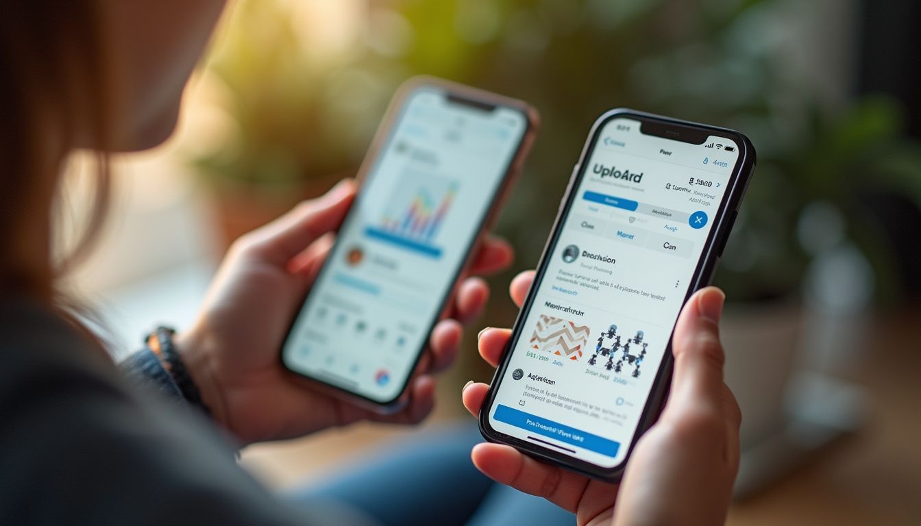
Before announcing virtual try-on to customers, run through this quality checklist on actual mobile devices—not just browser DevTools in responsive mode. Testing on real devices reveals interface, performance, and flow issues that don't appear in simulated environments.
Verify that try-on loads on your hero SKU within acceptable time—under 10 seconds from button click to result display. Test that variant changes (color, style) update the correct garment image in the try-on model. Confirm that add-to-cart functions normally after completing a try-on session—some implementations break the ATC click handler. Check that your sticky ATC and size drawer still work if your theme uses those patterns.
Walk through the complete upload flow as a customer would experience it. Does the photo upload feel private and secure? Is it clear what happens to the uploaded image? Can you easily retake or choose a different photo if the first attempt isn't ideal? Does the generated result preserve garment details like texture, fit, and drape? Does it avoid distorting the person's face or creating uncanny valley effects?
Run a "helpful content smell test" as recommended by Antla: does try-on add real decision value, or is it a gimmick? If you wouldn't use this feature yourself when shopping, it's not ready. The threshold is simple—try-on should make you more confident about purchasing than product photos alone. If it doesn't clear that bar, adjust placement, improve messaging, or reconsider whether the implementation quality is sufficient.
Soft Launch Strategy: Start With Hero SKUs

Don't flip try-on live across your entire catalog on day one. Start with five to ten hero SKUs where you have documented fit problems, high return rates, or frequent "how does this fit?" support tickets. Roll out with hypotheses you can actually measure, not vague hopes for improvement.
Structure your pilot SKU list around testable assumptions. For denim: try-on reduces customers ordering two sizes of the same item (bracketing rate). For dresses: try-on improves add-to-cart rate after engagement. For swimwear: try-on lowers returns specifically citing coverage concerns. For blazers: try-on increases time on page and engagement depth. Each SKU type tests a different aspect of try-on value.
Before launching, collect baseline metrics for these specific products: add-to-cart rate, conversion rate, return rate, return reasons, and bracketing rate if you track it. You need these numbers to measure whether try-on actually moved the metrics you care about. If you're using Shopify's virtual fitting room analytics, set up tracking before you flip the feature live.
Run the pilot for two to four weeks before deciding to expand, adjust placement, or fix supporting copy. Track try-on start rate (what percentage of viewers click the button), completion rate (what percentage who start actually generate a result), and post-try-on conversion. Most importantly, segment conversion and return metrics between customers who used try-on versus those who didn't—this isolates the feature's actual impact.
Analytics and Success Metrics That Actually Matter
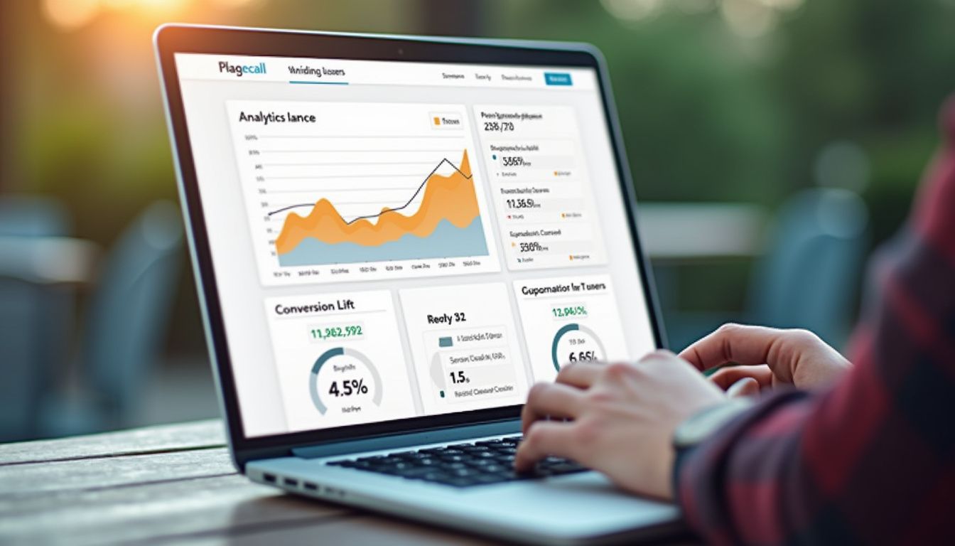
After two to four weeks, compare try-on users to non-users weekly. Product page engagement and conversion quality defines healthy engagement versus distraction. Look for four primary signals that indicate try-on is working: try-on start rate above your visibility threshold, higher conversion among try-on users, lower return rate or improved return reasons, and support tickets shifting from "how does it fit" questions to shipping and styling inquiries.
Try-on start rate (percentage of product page viewers who click the try-on button) indicates visibility and perceived value. For above-the-fold placement on fit-sensitive categories, expect 15-30% start rates. Below 10% suggests poor placement or unclear value proposition. Above 40% indicates either exceptional placement or customers who are highly motivated by fit uncertainty—pay attention to which SKUs drive highest engagement.
Conversion lift among try-on users is the primary success metric. If try-on users convert at the same rate or lower than non-users, the feature isn't delivering value—it's adding friction. Target 1.5-2x higher conversion among customers who complete a try-on session. This doesn't mean try-on caused all that lift (try-on users are self-selecting and more engaged), but directionally it should show clear positive correlation.
Return rate and return reason analysis reveals whether try-on improves purchase confidence. Export return reasons for the last 90 days grouped by SKU family. Compare fit-related return rates between try-on and non-try-on orders. A successful implementation should show measurably lower "doesn't fit", "wrong size", or "looked different than expected" returns among customers who used virtual try-on. This is where the ROI calculation becomes concrete—each prevented return saves you return shipping costs, restocking labor, and lost margin on discounted resale.
Pairing Try-On With Your Complete Product Page Stack

Virtual try-on is one piece of an apparel product page, not the whole solution. As Craftshift emphasizes, try-on answers "how will this look on me?" but doesn't answer "show me this exact color" or "which size fits my measurements." A try-on button on top of a messy gallery with poor color handling still loses sales.
The highest-impact visual fix for most apparel stores is variant image filtering and color swatches. A dress available in 8 colors carries 40+ images in one gallery. Without filtering, a customer who clicks "blue" still scrolls past every other shade. Filtering the gallery to show only the selected color's images, combined with clickable color swatches instead of a dropdown, transforms the browsing experience. Pair filtered galleries with try-on so customers see the right color in both the product photo and on themselves.
Add a proper size chart next to your try-on button. Try-on shows visual fit; the size chart provides measurements. Customers need both. Include garment measurements (not just body measurements) so someone can compare against clothes they already own. If you sell categories like denim or intimates where fit preferences vary widely, consider adding a fit finder quiz that recommends sizes based on body measurements and preferences.
Before piling on six different apps, run an app stack audit. Each app adds JavaScript, third-party requests, and potential layout conflicts. The full apparel stack should include try-on, color swatch management, size chart, and reviews—but each tool should pull its weight in conversion or margin improvement. If an app adds half a second of load time without measurable impact, remove it.
Expanding Beyond Initial SKUs: Rollout Plan
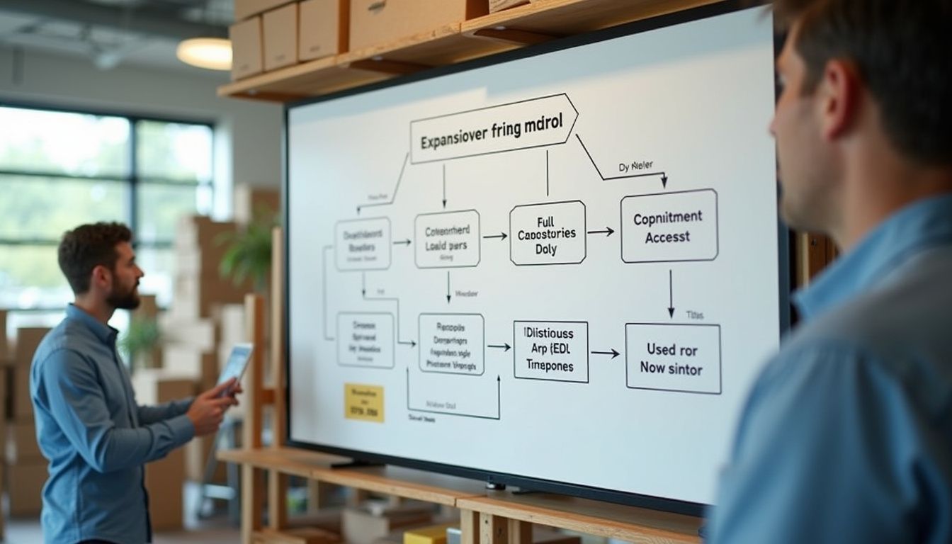
After your hero SKU pilot proves try-on value through measurable conversion or return improvements, expand systematically rather than flipping it live everywhere at once. Prioritize categories by return rate and customer fit questions. Swimwear, dresses, and denim typically show the strongest results because they're fit-sensitive and visually distinctive.
Roll out by category rather than randomly across products. Enable try-on for all dresses, measure for a month, then enable for all denim, measure again. This staged approach lets you identify category-specific issues before they affect your entire catalog. Some categories may not benefit from try-on—basic tees and accessories often see lower engagement because fit is less critical or visual uncertainty is low.
Watch for category-specific technical issues during expansion. Not all garment types render equally well. Highly textured fabrics like cable knits or heavily detailed items like beaded tops may not preserve detail accurately in generated try-ons. If a category shows high try-on engagement but low conversion lift or higher returns, the technology may not be ready for that specific product type. It's acceptable to disable try-on for categories where it doesn't help.
Revisit your placement and copy as you expand. What worked for dresses may need adjustment for outerwear or swimwear. Test mobile placement especially carefully—mobile traffic patterns and screen space constraints vary by category. A customer shopping for a coat on mobile behaves differently than someone browsing bikinis. Your try-on implementation should adapt to those different contexts.
Common Implementation Mistakes to Avoid
The most common mistake is treating try-on as a separate feature rather than integrating it into your product decision flow. Merchants who create a standalone "Virtual Try-On" page or bury the button in a "Tools" dropdown see single-digit engagement rates. Try-on needs to appear at the natural point where customers are deciding whether to buy, which is on the product page near the add-to-cart button.
Second most common: launching across the entire catalog without baseline metrics or hypotheses. You can't prove try-on improved anything if you don't know what the metrics were before you added it. Even if you're confident it will help, establish baselines for your hero SKUs first. The data will guide your expansion strategy and justify the app subscription cost to stakeholders who question whether the investment pays off.
Third mistake: optimizing for desktop when mobile drives the majority of fashion traffic and provides the natural try-on use case. Many merchants position try-on prominently on desktop while making mobile customers hunt for it or hiding it entirely. Test on actual mobile devices before launch, and check placement on both iOS Safari and Android Chrome—the two dominant mobile browsers with different behavior.
Fourth: ignoring page speed impact. Some try-on implementations load heavy JavaScript libraries or high-resolution model assets that add seconds to your product page load time. Check your page speed score before and after adding try-on. If the app adds more than 0.5 seconds to mobile load time, that delay costs you more in abandoned sessions than try-on gains you in conversion. Choose apps built for performance or work with the vendor to optimize.
Next Steps: From Installation to Optimization

You now have everything needed to add virtual try-on to your Shopify clothing store in under 10 minutes. The implementation is straightforward: install a Built for Shopify try-on app, add the button block below your add-to-cart area, customize the appearance, test on mobile, and launch on five to ten hero SKUs with documented fit problems.
Your first 30 days focus on measurement, not promotion. Let the feature run quietly on your pilot SKUs while you collect data. Track try-on start rate, completion rate, conversion among try-on users versus non-users, return rate, and return reasons. After two to four weeks, you'll have enough data to decide whether to expand to full categories or adjust placement and messaging first.
Most merchants who implement try-on correctly see measurable results within the first month—higher engagement on pilot SKUs, improved conversion among try-on users, or shifted return reasons away from fit complaints. These improvements justify expanding to additional categories. The goal isn't to get try-on on every SKU immediately; it's to prove value on high-impact products first, then scale systematically.
For ongoing optimization, revisit your category-specific copy quarterly, test alternative button placements on low-converting SKUs, and audit which product types drive highest try-on engagement versus lowest conversion lift. Not every category benefits equally from virtual try-on. Focus your energy on the products where visual fit uncertainty is highest—that's where try-on delivers the clearest ROI.